Graphical slice-n-dice
Humans are visual creatures. Effective visualization helps us intuitively recognize patterns and spot unusual outliers. It also enables smooth exploration—allowing users to drill down from a visual plot directly to the underlying data points.
While many existing tools support statistical visualization and drill-down features, they often fall short when it comes to integrating with custom visualizations used in computer vision workflows.
SenseTable bridges this gap by letting you plug in your own visualizations via iframes, seamlessly linking them with the main plot. With just a button click, you can view more associated samples—efficiently selected using a reservoir sampling algorithm.
Histogram
To visualize the cross-distribution of a numerical column and a categorical column, you can use histogram.
Try yourself here
Bubble Plot
For two numerical columns, SenseTable leverages bubble plot instead of scatter plot, in order to support large scale datasets.
Try yourself here
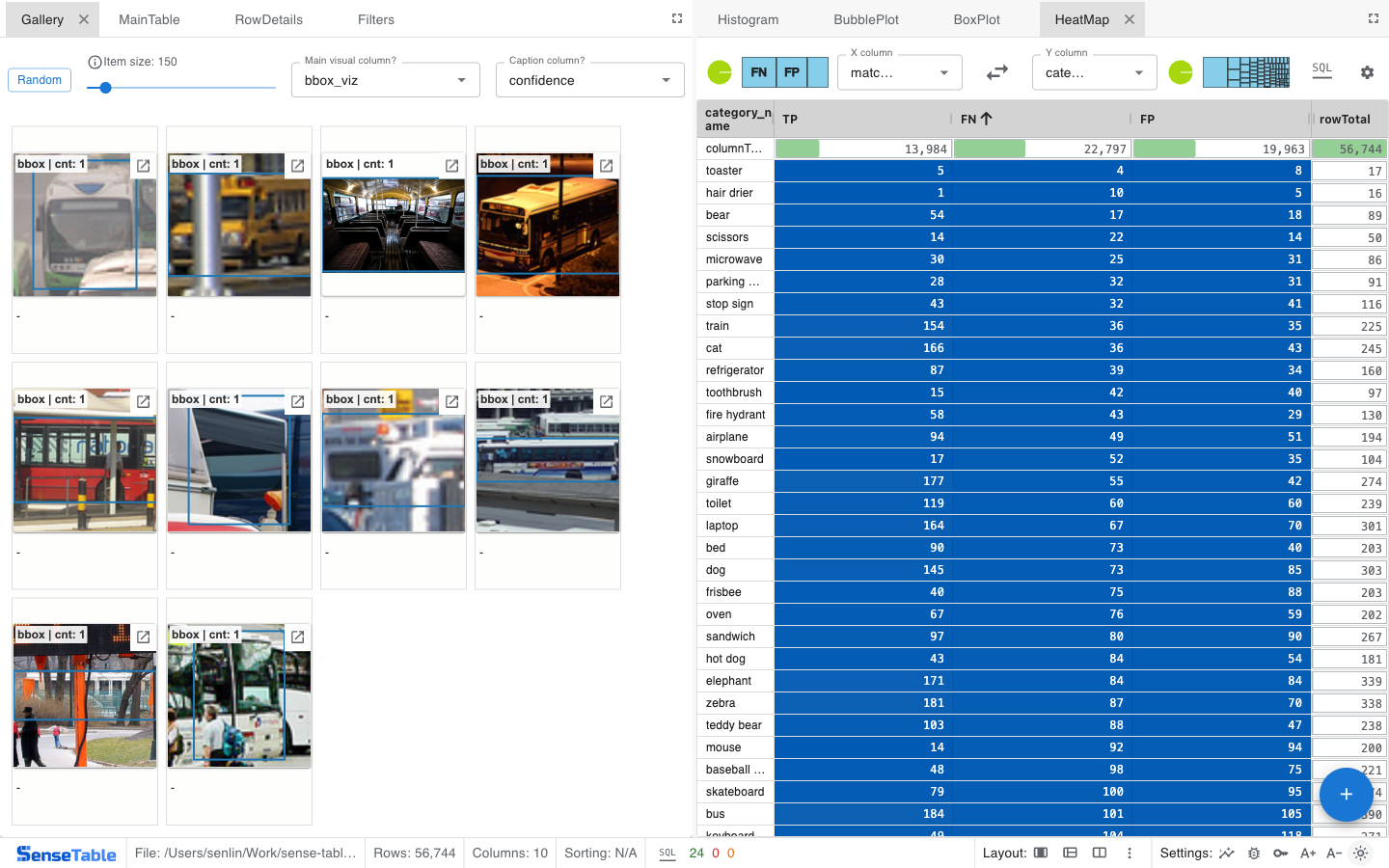
Heatmap
Boxplot
Box plots are a powerful way to compare the distribution of numerical columns across different groups. SenseTable integrates box plots directly into tables and enhances them with additional features:
- Consistent scaling: Box plots for the same column share a global range, making it easy to compare distributions across rows at a glance.
- Flexible sorting: You can sort rows based on various statistics—including max, min, average, median, Q1, Q3, or skewness—depending on your analytical needs.
- Drill through: See random samples for each qauntile.
Try yourself here