Tabular slice-n-dice
Overview
The default layout includes three main panels:
- Column Navigation (left panel): This panel helps you quickly navigate through your dataset’s columns—especially useful when working with dozens or even hundreds of columns. You can use it to hide or show columns, change their render types, and reorder them.
- Main Table (center panel): Displays the data table with column distribution plots embedded in the header, providing immediate visual insights.
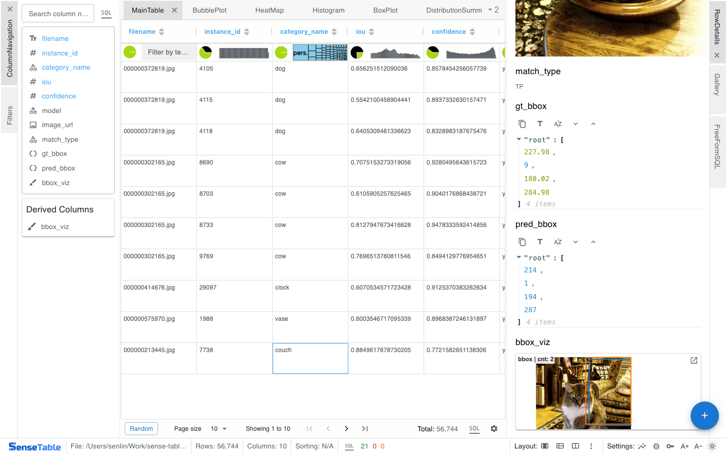
- Row Details (right panel): When a row is clicked, this panel displays all its column values in a structured view for deeper inspection.
Column header plots
The header plots convey important insights at a glance, giving you an intuitive understanding of each column’s type and distribution:
- Dark green pie charts show the percentage of null values, helping you quickly assess data completeness.
- Numerical columns display histograms that reveal the shape and spread of the data. Examples:


- Categorical columns show treemaps, highlighting the relative frequency of each category. Examples:


- Text columns come with a quick filter:

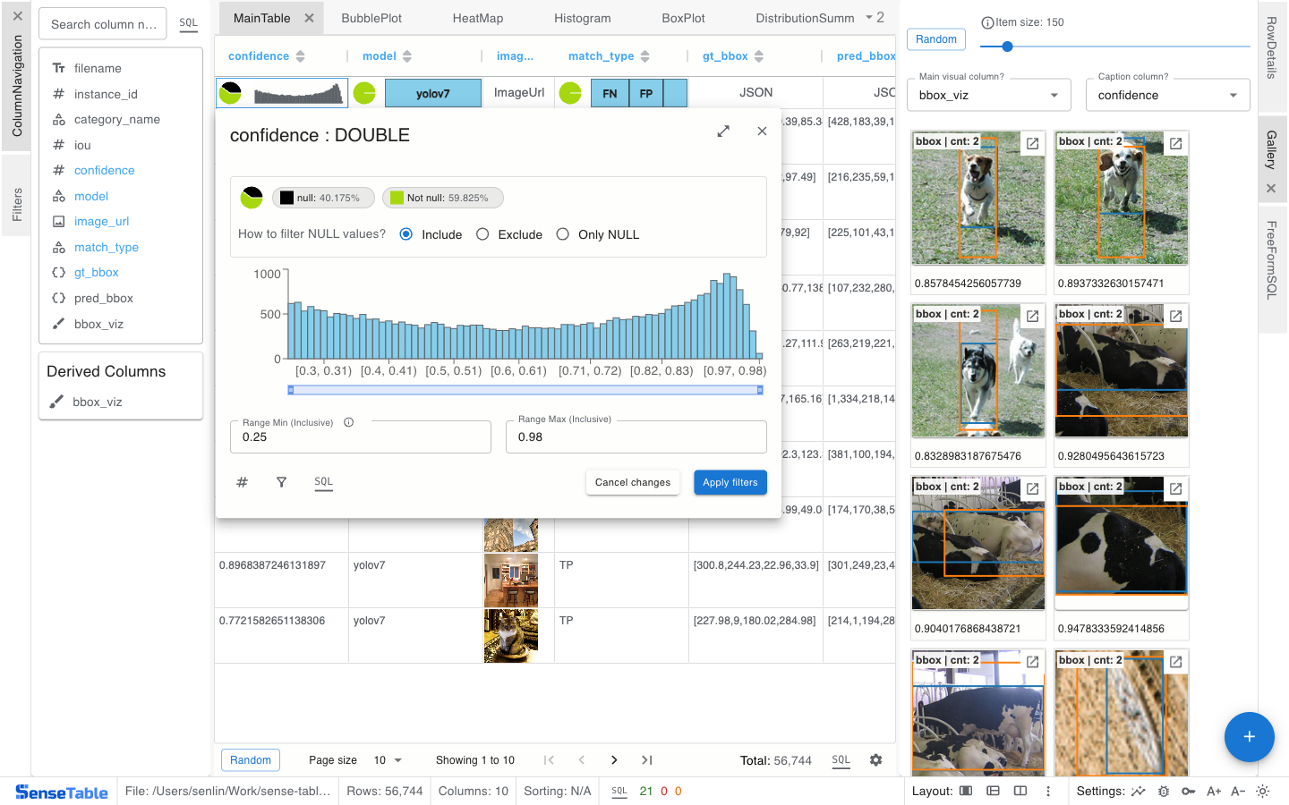
Numerical columns
Clicking on the mini plot , you will see an enlarged histogram plot along with a brush to filter values by range.
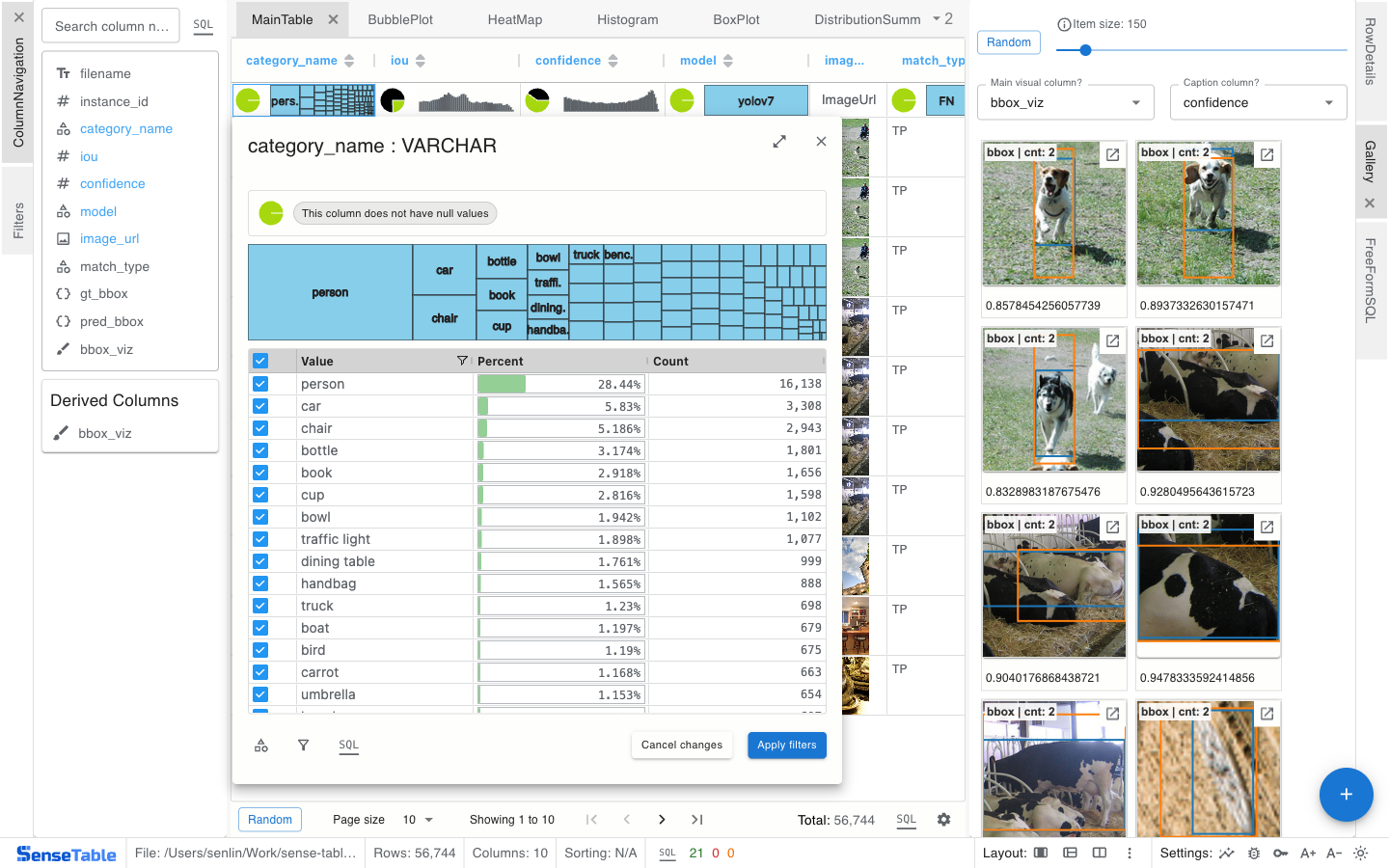
Categorical columns
Clicking on the mini plot , you will see tree map with more details and percentage for each value.